Useful sites
- www.runningwithtweezers.com (advice on styling tough foods)
- www.delorescuster.com (food styling teacher)
- www.mattarmendariz.com (food photographer)
- www.pfephoto.com (photographer)
- www.foodgawker.com
- www.gettyimages.com
- http://www.zencancook.com/
- http://www.creativelive.com/courses/food-photography-andrew-scrivani (food styling course online)
Video
- http://www.youtube.com/watch?v=GXfNL3eovwM
- http://www.youtube.com/watch?v=tsUKwhxd0jY
- http://www.youtube.com/watch?v=Z09C5HMEppE
- http://www.youtube.com/watch?v=052a5UZr4U0
- http://www.youtube.com/watch?v=xNGi_7dVebk
- http://www.youtube.com/watch?v=6MkzxYsneSM
- http://www.youtube.com/watch?v=slLGniM_mJA (Jamie Oliver example)
- http://www.youtube.com/watch?v=LR1zxUTgtPU
- Do a screen test
- Make a script - bullet points
- Enthusiasm like you are telling it to a friend who wants to listen to you
- Act like you want to be here, smile
- Don't talk too fast/slow
- Be concise
- Be confident & passionate - talk as though it is important that people hear your message
- Use hands - 55%
- Vary tone - 38%
- Make eye contact - look into the lense
- Be natural - pretend in the lense is a little friend
- Good posture - shoulders back
- Look decent
- Tag video
Checklist
Lighting
- Natural
- Use if possible
- Diffuse
- Reflect
- Best time: 2 hrs after sun rise, 2hrs before sunset (depends on this matching chosen window)
- Artifical
- Daylight balanced
- Diffuse
- Reflect
- Use side lights - between 2-4'o'clock or 8-10'o'clock
Angles
- 3/4 (preferred - between overhead and eye level)
- Overhead
- Eye level
- Try lots
Camera Settings
- Set white balance
- Set exposure level
- Set ISO = 200
- Set grid on (supports rule of thords composition)
- Set f = 3.5
Composition
- Garnish
- Pick ingredients from recipe
- Herbs - whole or as a bouquet garni
- Spices - whole or powdered
- Salt & pepper - scattered or in small bowl
- Egg shells
- Lemon wedges/squeezed lemons
- Nuts
- Fruit
- Add accompaniments
- Torn bread rolls
- Salad bowl
- Tea/coffee/wine/water/fruit juice
- 1/2 eaten biscuit
- Rule of Thirds
- Shoot centred and off-centre
- Focus at centre and half press (auto) then move and shoot
- Focus at centre and move and shoot (manual)
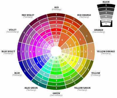
- Use colour wheel
- Shades of the same (including white)
- Adjacent colours
- Opposite colours (e.g. brown food and blue towel/bowl)
There are 6 common colour schemes used in art & design. These areMonochromatic, complimentary, analogous, split complimentary, triatic and tetradic.
MONOCHROMATIC
Monochromatic colours are all the hues (tints and shades) of a single color. The tints and shades add depth and highlights. Simply select one "portion" such as blue from the colour wheel. The example is a blue-green monochromatic.COMPLIMENTARY
Complimentary colours are those directly opposite each other on the wheel e.g red & green; blue & orange. They look good together and compliment each other. You can use them to create sharp contrasts or mix them to create a neutral grey.ANALOGOUS
These are colours next to each other on a colour wheel. Select any quarter of the wheel for an Analogous colour scheme.
As they are similar to each other they blend well particularly if one colour is used as the dominant and the others to add highlights. They create a sense of harmony and blend well together and are effective at showing depth. You will use this in your colouring such as with copic markers.SPLIT COMPLIMENTARY
The split complementary scheme is a variation of the standard complementary scheme. It uses a colour and then two colors adjacent to its complementary. It is a good choice for beginners, I use it the most myself!
TRIATIC
Probably the most common scheme used in cardmaking and scrapbooking, this involves using three colours spaced evenly around the wheel as it balances warm and cool colours. For best use let one colour dominate and use the others as highlights. It gives a strong visual contrast while maintaining balance.
TETRADIC
The tetradic (also known as a double complementary) scheme uses four colours arranged into two complementary color pairs (as in a rectangle). This colour scheme can be difficult to use in equal amounts so you should choose one of the colours to be dominant and the others to highlight.
Difficult foods
- Salad
- Build layer of greens
- Spritz with water
- Add large items
- Add small items
- Dress just before shooting
- Fish
- Shoot whole fish (raw or cooked)
- Chocolate
- Add berries and icing cugar
http://www.therecipewiz.com/